Monday, July 31, 2023

Libertine

The open license Linux Libertine typeface is sometimes touted as a Times New Roman replacement, though the two do not look particularly similar. Libertine is more in the style of such mid-20th Century neoclassical designs as Berling and Palatino.

But it is metrically equivalent to Times. That is, the same words in either typeface should take up about the same amount of space on a page. This means Libertine, as Times, is somewhat closely spaced, though it does not tend to look as cramped in long lines of text. We might compare it more to Adobe’s Minion, which is similarly economically spaced (and resembles more than a bit).

It may be noted that other typefaces also are equivalent to Times New Roman. That was a common goal in the early days of free typefaces, when TNR was ubiquitous both on and off line. The popular Gentium is one of the most successful of these, though it has more of a Goudy-like appearance (to us, anyway).

Is Libertine a decent typeface? Would we use it as book text? The answer must be a definite ‘maybe.’ One can pick at little details of the design but overall we feel it works pretty well. Definitely as well as many commercial fonts available. But, as Palatino, we might be inclined to reserve it for jobs other than novels. Poetry, perhaps—we have employed Gentium effectively for collections, making sure to keep it relatively large and well spaced. These are type faces that need room to breathe, that might look crowded on the page of a typical novel. Or, as with Minion (or even Times), Libertine could be effective in books or magazines with the text laid out in double columns, on wider pages.

This does not mean we would never use it a body text in a novel. We tested replacing the Berling we used in a couple novels with Linux Libertine and it fitted rather well. Yes, and it looked pretty good, too. So perhaps a future novel from Arachis Press will appear set in Libertine; we do intend to move to open license type, after all, and this one should give us no surprises. It can be one of those workmanlike choices we should all have available as a fall-back choice.

And we would be willing to recommend it as a choice for someone new to setting up a novel (or other book). It will work—and it’s way better than Times!

Saturday, July 15, 2023

Stones in the Sea

Today, July 15 2023, is the official release date for Stephen Brooke’s latest fantasy novel, STONES IN THE SEA. Here are the links for print and ebook at our store:

PRINT: https://www.lulu.com/shop/stephen-brooke/stones-in-the-sea/paperback/product-z2mrvk.html
PDF: https://www.lulu.com/shop/stephen-brooke/stones-in-the-sea/ebook/product-z2wzrg.html
EPUB: https://www.lulu.com/shop/stephen-brooke/stones-in-the-sea/ebook/product-z2wvvz.html

Print should show up retailers 'everywhere' eventually, if it has not already.

We also continue to roll out new editions of our books with revised typesetting. That is a matter of both licensing and improved appearance.

Friday, May 12, 2023

July Release

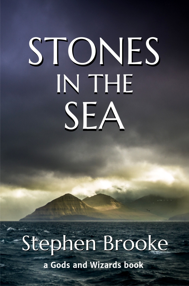
 We have set the official release date for Stephen Brooke's new fantasy novel, "Stones in the Sea," for July 15, 2023. It will be available in print, PDF, and EPUB. Here is the cover:

And the rear cover blurb:

Where to sail but west after escaping his Chilean prison? Into the depths of the Pacific voyaged Yankee seaman Dick Brown, seeking refuge and rest beyond the horizon. What he found was another world, one where his coming had been prophesied, where his destiny was tied to the mystic gems known as the Jewels of the Elements. On lost islands, in mountain fastnesses, Dick discovers that destiny and his place in a new world.

STONES IN THE SEA, a novel by Stephen Brooke

Tuesday, April 11, 2023

Twelve

We began our publishing journey twenty years ago with the release of Stephen Brooke's first poetry collection, "Pieces of the Moon." On the 21st we will officially publish his twelfth collection (and our 52nd book), "Islanders." Available in print, PDF, and EPUB.


Monday, April 10, 2023

Crimson

Not long ago, I was recommending Crimson Pro over earlier versions of the Crimson typeface, which had various relatively minor problems. The Pro version was a redesign (not by the original designer) done at the request of Google. There were some fairly noticeable changes to the appearance but the other improvements made these acceptable. Crimson Pro remains a perfectly good and usable typeface, but one that is perhaps better for online use than print.

Then I found that Crimson Text had undergone a revision last year that addressed most of the problems. The Text version, at least to me, seems a more attractive font and a better choice for print. Pro seems to have a taller x-height, the details of serifs etc are more squared-off, and it has other small changes that might make it more readable on a web page but are not so desirable on a printed page. Not that it wouldn’t work, but Crimson Text looks more suited to that role, as well as more 'elegant' (which is very much a matter of personal judgement and taste). There have been comparisons of Crimson to Adobe’s Minion—and one can find similarities—but to my eye, it is more reminiscent of Plantin. And, as Plantin, it is an unassuming, do-it-all, Garamond-esque typeface (although Plantin derives more from the type of Granjon than Garamond). Crimson Text is certainly a useful font to have available.

Make certain you are getting the 2022 version of Crimson Text. What is offered at Google Fonts may not be the latest iteration but the face can be found at its GitHub project page. One of the problems with earlier Crimson type was that it didn’t always print properly in POD applications. This has supposedly been remedied but it would be prudent to watch for that sort of problem (it’s not the only typeface that’s been problematic in POD, including some that are commercial offerings).

No, Arachis Press has not released any books set in any version of Crimson. We almost certainly will, even if we do have a licensed version of Plantin available (we’ve used Plantin in a half-dozen books). It’s just the sort of fall-back typeface that is useful to have in ones toolkit, with an open license so we never need to worry about commercial use.

Monday, March 27, 2023

Humanist Slab-Serifs

The Mid-Twentieth Century saw the emergence of what are sometimes called (accurately enough) ‘humanist slab-serif’ typefaces. These retained—for the most part—the rectangular serifs of earlier slab fonts but varied the axis and the other strokes to create a more humanist feel to the forms, as with the humanist sans faces that were appearing in the same period. One seemingly simple yet elegant example is Candida, which received greater recognition when Bitstream reissued it half a century later.

Around the same time, the company released a somewhat similar humanist slab of their own design, Prima. At first glance, they seem quite alike but one begins to pick out the differences quickly enough. Prima is rather unlovely beside Candida, but the latter undoubtedly influenced (or inspired) its design. It may be noted that Prima, as Adobe’s Utopia and Bitstream’s own Charter, was designed to work well with the low resolution printers of its time.

A second look will tell us Prima is pretty much identical to Bitstream’s Vera Serif, which has since developed into Deja Vu, a popular and widespread free font. Why the name change? In part, we would assume, to mark it as their open license (more or less) offering. An entire family of different fonts was attached to both Prima and Vera, sans and mono versions, designed with the same uses in mind. Deja Vu Serif is certainly a decent enough font, and beloved of the open source community, but we would be unlikely to use it to print a book.

Candida, maybe, but we’d have to pay for a license! In honesty, it’s not the sort of typeface we’d normally consider for a novel. Perhaps for some niche project it would be just the thing. There are, to be sure, other nice-looking humanist slab-serif typefaces available, and some are even open license. It has again become a rather popular concept and more than one recent release, such as IBM’s big family of typefaces, has reflected the trend. By the way, we think IBM Plex Serif is decidedly ugly (a pastiche of varying styles). We’d take Deja Vu over it, any day—it, at least, stays true to its concept.

Kameron, by Vernon Adams, looks pretty decent and is available from Google Fonts. Its lack of a separate italic is, however, problematic, and it is perhaps not really suitable to book text. To be sure, there are also a number of faces that almost fit the classification but are not quite humanist or not quite true slabs. There is not a big gap between humanist slab-serifs and some neoclassical fonts. As always, how they look on the page is more important than what category we place them in.


Islanders Promo

 Stephen Brooke's latest poetry collection, ISLANDERS, is coming in April.