Showing posts with label free fonts. Show all posts

Monday, July 31, 2023

Libertine

The open license Linux Libertine typeface is sometimes touted as a Times New Roman replacement, though the two do not look particularly similar. Libertine is more in the style of such mid-20th Century neoclassical designs as Berling and Palatino.

But it is metrically equivalent to Times. That is, the same words in either typeface should take up about the same amount of space on a page. This means Libertine, as Times, is somewhat closely spaced, though it does not tend to look as cramped in long lines of text. We might compare it more to Adobe’s Minion, which is similarly economically spaced (and resembles more than a bit).

It may be noted that other typefaces also are equivalent to Times New Roman. That was a common goal in the early days of free typefaces, when TNR was ubiquitous both on and off line. The popular Gentium is one of the most successful of these, though it has more of a Goudy-like appearance (to us, anyway).

Is Libertine a decent typeface? Would we use it as book text? The answer must be a definite ‘maybe.’ One can pick at little details of the design but overall we feel it works pretty well. Definitely as well as many commercial fonts available. But, as Palatino, we might be inclined to reserve it for jobs other than novels. Poetry, perhaps—we have employed Gentium effectively for collections, making sure to keep it relatively large and well spaced. These are type faces that need room to breathe, that might look crowded on the page of a typical novel. Or, as with Minion (or even Times), Libertine could be effective in books or magazines with the text laid out in double columns, on wider pages.

This does not mean we would never use it a body text in a novel. We tested replacing the Berling we used in a couple novels with Linux Libertine and it fitted rather well. Yes, and it looked pretty good, too. So perhaps a future novel from Arachis Press will appear set in Libertine; we do intend to move to open license type, after all, and this one should give us no surprises. It can be one of those workmanlike choices we should all have available as a fall-back choice.

And we would be willing to recommend it as a choice for someone new to setting up a novel (or other book). It will work—and it’s way better than Times!
Tuesday, January 10, 2023

The Free Font Ground-Breakers

Loads of free typefaces flooded the internet pretty much as soon as there was an internet. Many of them were pretty awful, perhaps having some use as display fonts but definitely not suited for use as print text. We’re talking original typefaces here, not clones or copies of older designs (though they certainly could be inspired by them). We’ll write of five serif body-text faces from those early days that were good enough to have survived and flourished.

The first is Deja Vu, the darling of open license fans everywhere, and common in the Linux world. This font has undergone various iterations and redesigns since a form of it first appeared as Bitstream’s Prima, later morphing into Vera and the Deja Vu most commonly distributed today. As some of its successful contemporaries, it was designed to work well with low resolution screens and printers, having simplified forms. Deja Vu is essentially in the humanist slab-serif style, with similarities to such older typefaces as Candida. There have been plenty enough new fonts (many free) of this sort released since but they are not necessarily any better. Not that Deja Vu is a particularly attractive font—we doubt we would print a novel in it. Possibly it could be useful for nonfiction or brochures or that sort of thing; it is readable at quite small sizes.

Bitstream released another font into the wild, intended for much the same roles: Matthew Carter’s Charter. This one draws from the Fournier designs of the Eighteenth Century (as does the somewhat more recent and similar Adobe Source Serif) but simplifies them into a sturdy and attractive font suited to the needs of the time. As computers and printers improved, those needs lessened but Charter remains a quite good and quite free typeface. We would have no qualms about printing a fiction book in Charter (or nonfiction, for that matter), though there are more ‘elegant’ choices. It is a do-it-all font.

As is Adobe’s Utopia, which was designed with much the same roles in mind. Utopia has something of a slab-serif look to it but also draws from ‘Transitional’ and ‘Modern’ typefaces such as Baskerville. It is another all-purpose font. Adobe intended it as a Times alternative, for office use; although it never caught on for that role it remains a quite good typeface. We have issued fiction books set in Utopia. It provides a balance of modern utility and classic elegance. Were we forced to use one font for everything, it might well be our choice. Utopia became free, apparently, somewhat by accident. Be that as it may, it is definitely free to use as we will these days.

Our final two, Gentium and Linux Libertine, were not designed with the shortcomings of early computing in mind, but as traditional typefaces from their origin. Both are frequently referred to as Times replacements, and compared to that font, but we do not find either particularly similar to the Times typeface. Oh, some, to be sure; any serif text face is bound to have similarities or it would become unreadable!

Gentium does share one quality with Times and that is that it is somewhat closely spaced. That is the big problem with Times; it was designed for use in narrow newspaper columns and can become too dense on a book-width page (not to mention a sheet of typewriter paper). Gentium isn’t quite so tightly packed but it is something of which one should be aware. We have used it for poetry books but not for novels. This is not to say we never would. To us, Gentium has a bit of a Goudy-esque feel, with definite calligraphic elements. It is a nice looking but not ostentatious font, workman-like and most certainly usable.

Libertine draws somewhat from the mid-Twentieth Century neo-humanist movement that gave us such typefaces as Palatino and Berling. Although it has never caught on to any great extent as a book font, it may be found in use all over the internet. Wikipedia is the most obvious example. That familiarity could admittedly be a strike against using it for print. We have not used it for a book yet, but intend to in upcoming releases (as a replacement for the above-mentioned Berling). Libertine has the bonus of a true matching sans, Linux Biolinum (Deja Vu Sans has no family resemblance to Deja Vu Serif).

These five have been around for over thirty years, plenty enough time to be thoroughly tested. We would have no reservations about their dependability; whether they have the appearance one desires is another question and one that must be answered on an individual, book-by-book basis. But they will get the job done; they will not let one down.

Wednesday, December 28, 2022

Garamond

Garamond—yes, the typeface for your fiction book. You’re always safe using some version of Garamond to print that novel or short story collection.

Well, maybe not every version. I would advise against using the one that comes installed with Windows for two reasons. One, it is an ‘American’ Garamond, on the spiky and aggressive side, and based on the designs of Jannon rather than Garamond himself. Two, you do not actually own the rights to use it in a print book. Not that anyone is going to come after you if you send a book set in it off to a print-on-demand company, but you should recognize that you really are supposed to pay for a license to use it.

The same, of course, is true of today’s industry standard, Adobe Garamond. If you intend to pay for a typeface, you might as well go with the Adobe. It’s pretty authentic to the original fonts with just the right bit of modernization.

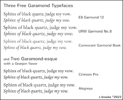
If you would prefer a free alternative, go for EB Garamond. It is practically identical to Adobe’s version, being based on the same original samples, and may be downloaded free. I would suggest the EB Garamond 12 that was the original version, not the EB Garamond that has recently shown up on Google Fonts; that newer take on the typeface has some changes that may make it better for online use but not so good for print. Not that it couldn’t be used, to be sure. One gives up small caps and old style numerals for more weights—most unneeded—and lining figures.

Before Adobe’s offering came along, perhaps the most authentic Garamond was that from the Stempel foundry—and its many clones. The URW++ version is totally free and open license, having been donated to the Ghostscript project decades ago. I’ve used it for several novels, more than any other typeface, I suspect (and I’m not going to stop and count right now). It looks good, it looks professional. It and the EB are the two top choices for free Garamonds.

Yet I shall mention another: Cormorant or, more precisely, Cormorant Garamond, the latter being a slightly altered version to make it a little more suited to body text. Incidentally, I would recommend the ‘book’ weight, not the regular, which looks a bit spindly. Cormorant, on the whole, veers closer to that American style of Garamond mentioned earlier. It is actually a quite attractive typeface, but perhaps not as readable for long stretches of text.

I shall also mention a couple free Garamond-adjacent typefaces, both of which tend toward the Granjon style (Granjon being one of Garamond’s assistants and successors). Excellent commercial fonts have been created in that Granjon mode, notably Plantin and Matthew Carter’s Galliard.

Plantin is a solid, workmanlike face that has been dependable for book text for a century. A pretty good replacement for it is Crimson. Do make sure you get the latest iteration of the design, Crimson Pro. It has finally made it to the totally professional level with this version. Crimson is one of those typefaces I could see using for pretty much anything but it may not have quite the sense of elegance one gets from Adobe or EB Garamond.

Alegreya is elegant, and makes a decent alternative to Galliard. It seems definitely inspired by Carter’s design; not a clone by any means but very much with the same light-hearted and adventurous feel. This is particularly evident in the italics. I do love Galliard but I think Alegreya may just replace it.

I mentioned the added weights in the newest version of EB Garamond. I find all those bolds and blacks and so on largely pointless, and generally not all that attractive (and bold italics can be an abomination). Good italics are more important—essential even—than a variety of weights, and I really prefer to have small caps available too. EB Garamond 12, Cormorant, and Alegreya do all include small caps.

Alegreya and Cormorant also have another point in their favor, and that is a matching sans typeface. I’ll readily admit I like Ysabeau, the sans companion to Cormorant, more than Cormorant itself. It and Alegreya Sans can both be useful for titling in a book set in any flavor of Garamond.

So, we have no excuse for not using Garamond in our next novel. Unless, of course, we prefer Caslon. I’ll have to talk about that some other time.