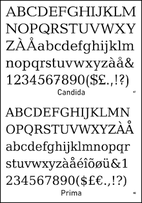
The Mid-Twentieth Century saw the emergence of what are sometimes called (accurately enough) ‘humanist slab-serif’ typefaces. These retained—for the most part—the rectangular serifs of earlier slab fonts but varied the axis and the other strokes to create a more humanist feel to the forms, as with the humanist sans faces that were appearing in the same period. One seemingly simple yet elegant example is Candida, which received greater recognition when Bitstream reissued it half a century later.
Around the same time, the company released a somewhat similar humanist slab of their own design, Prima. At first glance, they seem quite alike but one begins to pick out the differences quickly enough. Prima is rather unlovely beside Candida, but the latter undoubtedly influenced (or inspired) its design. It may be noted that Prima, as Adobe’s Utopia and Bitstream’s own Charter, was designed to work well with the low resolution printers of its time.
A second look will tell us Prima is pretty much identical to Bitstream’s Vera Serif, which has since developed into Deja Vu, a popular and widespread free font. Why the name change? In part, we would assume, to mark it as their open license (more or less) offering. An entire family of different fonts was attached to both Prima and Vera, sans and mono versions, designed with the same uses in mind. Deja Vu Serif is certainly a decent enough font, and beloved of the open source community, but we would be unlikely to use it to print a book.
Candida, maybe, but we’d have to pay for a license! In honesty, it’s not the sort of typeface we’d normally consider for a novel. Perhaps for some niche project it would be just the thing. There are, to be sure, other nice-looking humanist slab-serif typefaces available, and some are even open license. It has again become a rather popular concept and more than one recent release, such as IBM’s big family of typefaces, has reflected the trend. By the way, we think IBM Plex Serif is decidedly ugly (a pastiche of varying styles). We’d take Deja Vu over it, any day—it, at least, stays true to its concept.
Kameron, by Vernon Adams, looks pretty decent and is available from Google Fonts. Its lack of a separate italic is, however, problematic, and it is perhaps not really suitable to book text. To be sure, there are also a number of faces that almost fit the classification but are not quite humanist or not quite true slabs. There is not a big gap between humanist slab-serifs and some neoclassical fonts. As always, how they look on the page is more important than what category we place them in.

No comments:
Post a Comment