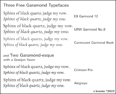
Garamond—yes, the typeface for your fiction book. You’re always safe using some version of Garamond to print that novel or short story collection.
Well, maybe not every version. I would advise against using the one that comes installed with Windows for two reasons. One, it is an ‘American’ Garamond, on the spiky and aggressive side, and based on the designs of Jannon rather than Garamond himself. Two, you do not actually own the rights to use it in a print book. Not that anyone is going to come after you if you send a book set in it off to a print-on-demand company, but you should recognize that you really are supposed to pay for a license to use it.
The same, of course, is true of today’s industry standard, Adobe Garamond. If you intend to pay for a typeface, you might as well go with the Adobe. It’s pretty authentic to the original fonts with just the right bit of modernization.
If you would prefer a free alternative, go for EB Garamond. It is practically identical to Adobe’s version, being based on the same original samples, and may be downloaded free. I would suggest the EB Garamond 12 that was the original version, not the EB Garamond that has recently shown up on Google Fonts; that newer take on the typeface has some changes that may make it better for online use but not so good for print. Not that it couldn’t be used, to be sure. One gives up small caps and old style numerals for more weights—most unneeded—and lining figures.
Before Adobe’s offering came along, perhaps the most authentic Garamond was that from the Stempel foundry—and its many clones. The URW++ version is totally free and open license, having been donated to the Ghostscript project decades ago. I’ve used it for several novels, more than any other typeface, I suspect (and I’m not going to stop and count right now). It looks good, it looks professional. It and the EB are the two top choices for free Garamonds.
Yet I shall mention another: Cormorant or, more precisely, Cormorant Garamond, the latter being a slightly altered version to make it a little more suited to body text. Incidentally, I would recommend the ‘book’ weight, not the regular, which looks a bit spindly. Cormorant, on the whole, veers closer to that American style of Garamond mentioned earlier. It is actually a quite attractive typeface, but perhaps not as readable for long stretches of text.
I shall also mention a couple free Garamond-adjacent typefaces, both of which tend toward the Granjon style (Granjon being one of Garamond’s assistants and successors). Excellent commercial fonts have been created in that Granjon mode, notably Plantin and Matthew Carter’s Galliard.
Plantin is a solid, workmanlike face that has been dependable for book text for a century. A pretty good replacement for it is Crimson. Do make sure you get the latest iteration of the design, Crimson Pro. It has finally made it to the totally professional level with this version. Crimson is one of those typefaces I could see using for pretty much anything but it may not have quite the sense of elegance one gets from Adobe or EB Garamond.
Alegreya is elegant, and makes a decent alternative to Galliard. It seems definitely inspired by Carter’s design; not a clone by any means but very much with the same light-hearted and adventurous feel. This is particularly evident in the italics. I do love Galliard but I think Alegreya may just replace it.
I mentioned the added weights in the newest version of EB Garamond. I find all those bolds and blacks and so on largely pointless, and generally not all that attractive (and bold italics can be an abomination). Good italics are more important—essential even—than a variety of weights, and I really prefer to have small caps available too. EB Garamond 12, Cormorant, and Alegreya do all include small caps.
Alegreya and Cormorant also have another point in their favor, and that is a matching sans typeface. I’ll readily admit I like Ysabeau, the sans companion to Cormorant, more than Cormorant itself. It and Alegreya Sans can both be useful for titling in a book set in any flavor of Garamond.
So, we have no excuse for not using Garamond in our next novel. Unless, of course, we prefer Caslon. I’ll have to talk about that some other time.


